Fann
- Brand design, Naming
A four-letter name and one committed colour: the brand is recognised before it is read.
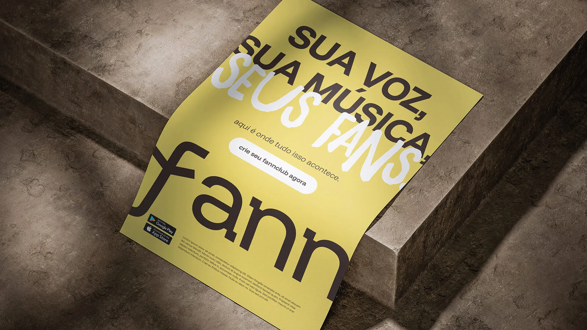
Context / Direction
Context. Fann was born as a new platform with no previous reference. It needed a short name — easy to say and to remember — and a brand that would work both on screen and in print.
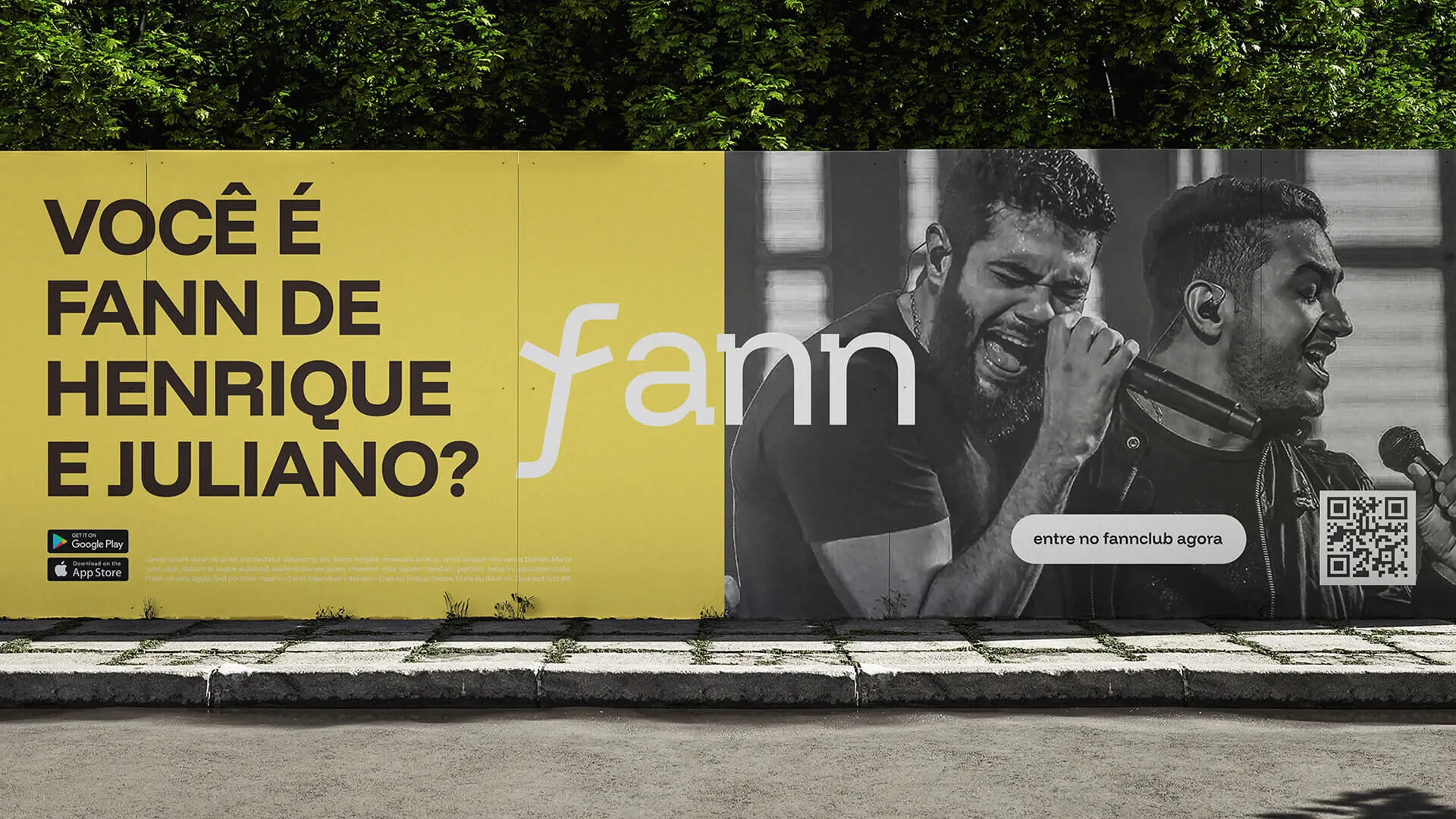
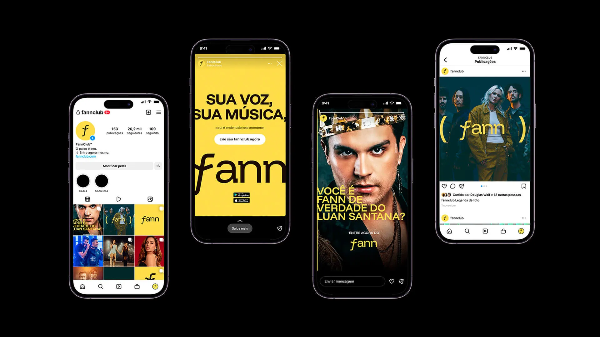
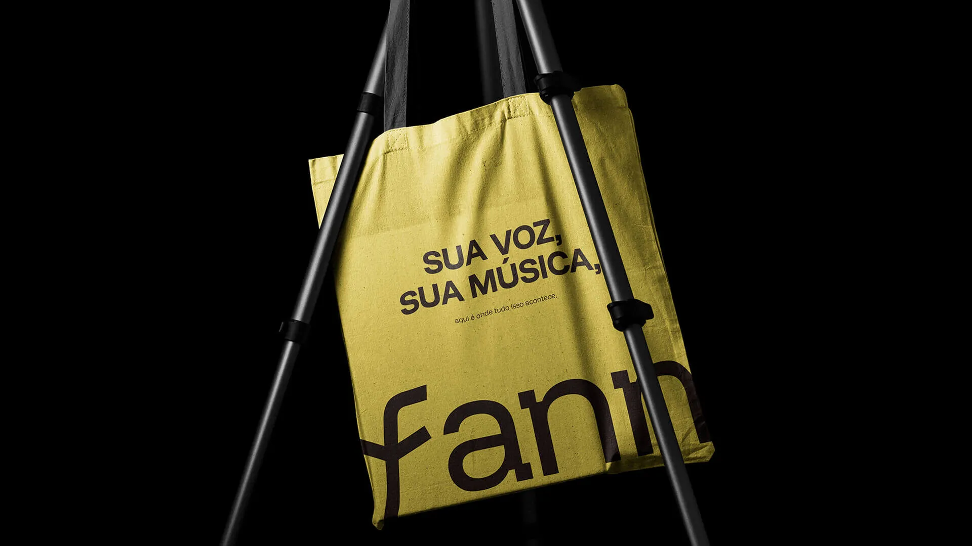
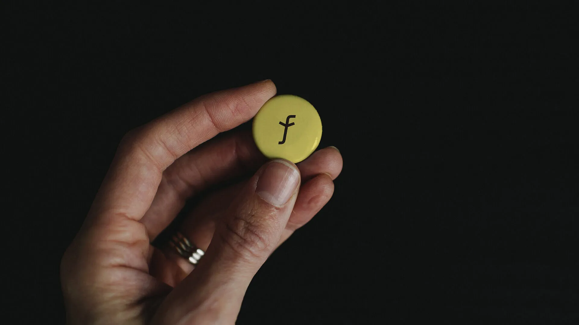
Decision. A four-letter name, a low-contrast wordmark and a yellow adopted as the identity colour. The choice was deliberate: in a crowded feed, colour arrives before reading does.
Outcome. Naming, visual identity, digital and print applications.
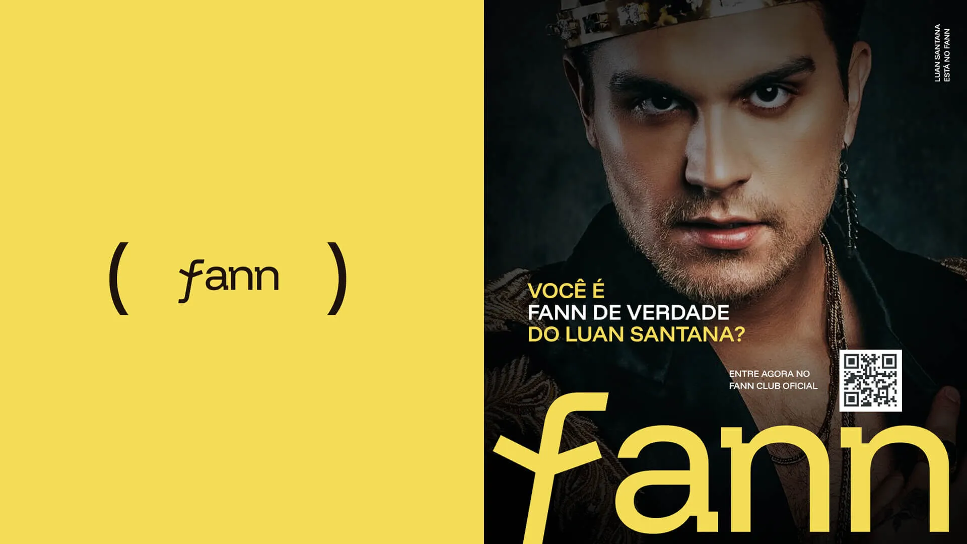
Decision
A four-letter name, a low-contrast wordmark and a yellow adopted as the identity colour. The choice was deliberate: in a crowded feed, colour arrives before reading does.
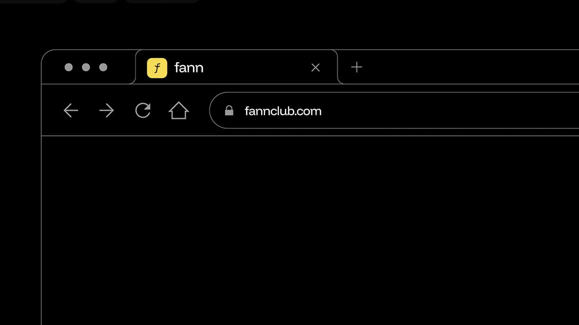


Outcome
Outcome
Naming, visual identity, digital and print applications.
Credits
- Douglas Wolf
Alax Productions