Kuryos Cosméticos
- Brand design
A cosmetics line organised to be recognised on the shelf.
Context / Direction
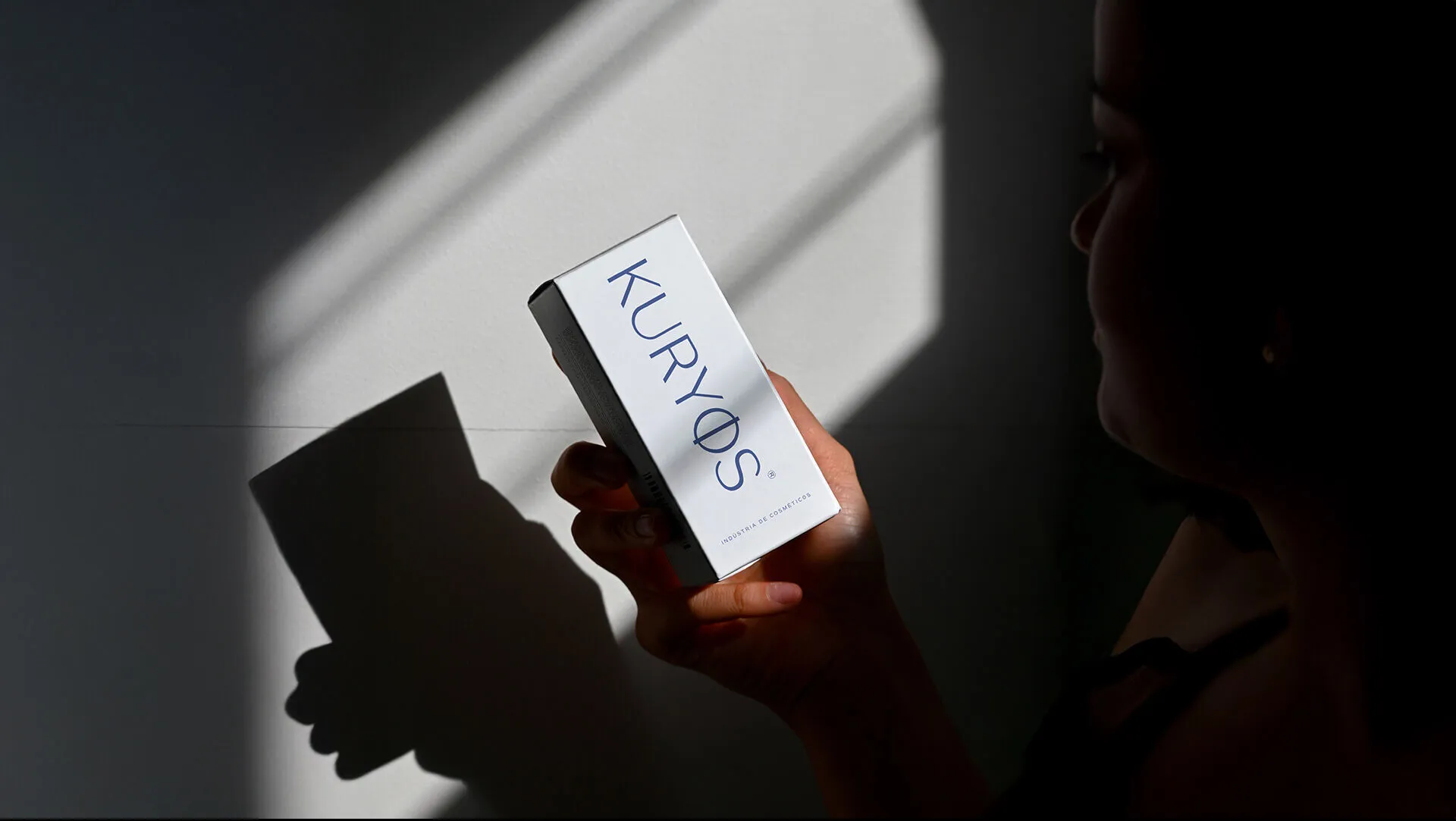
Context. Kuryos has a strong presence at the point of sale. The challenge was to organise a product line and build recognition on the shelf, where the brand competes for space with dozens of others.
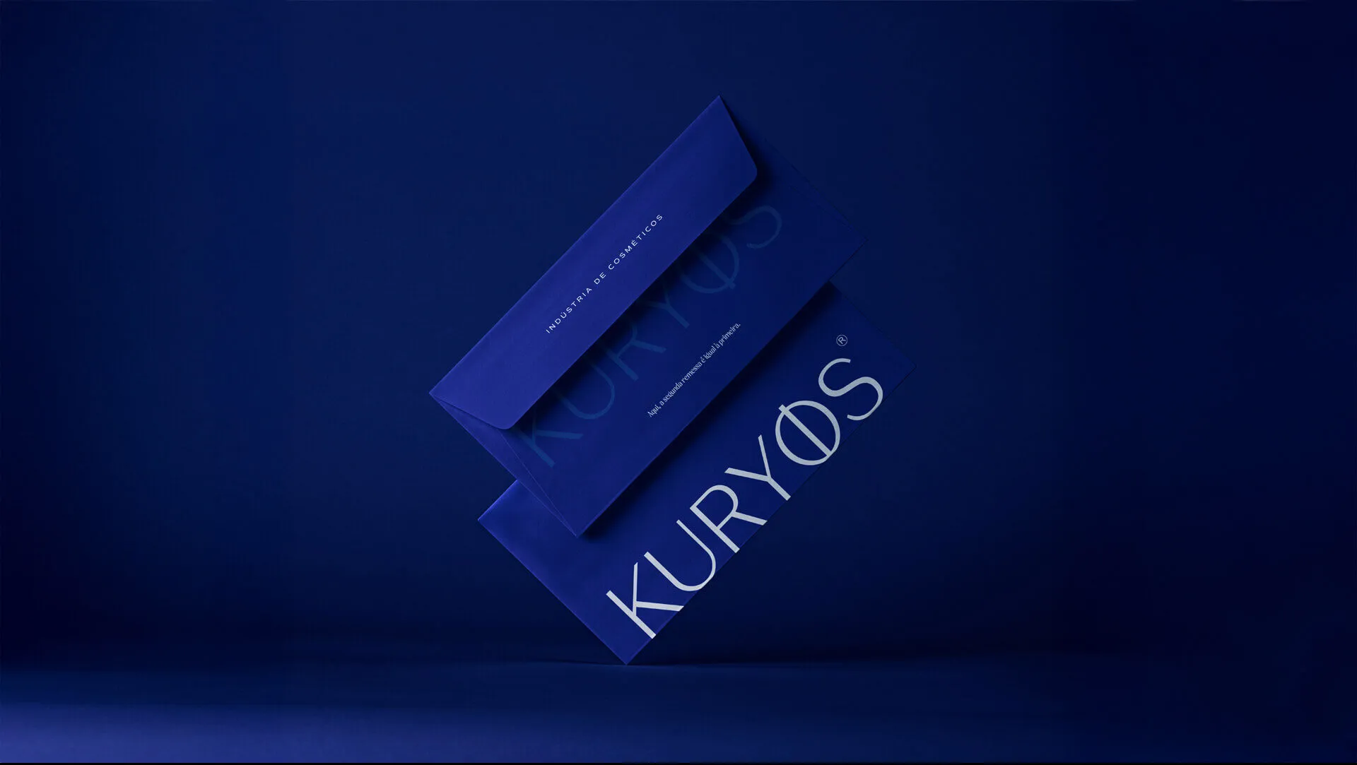
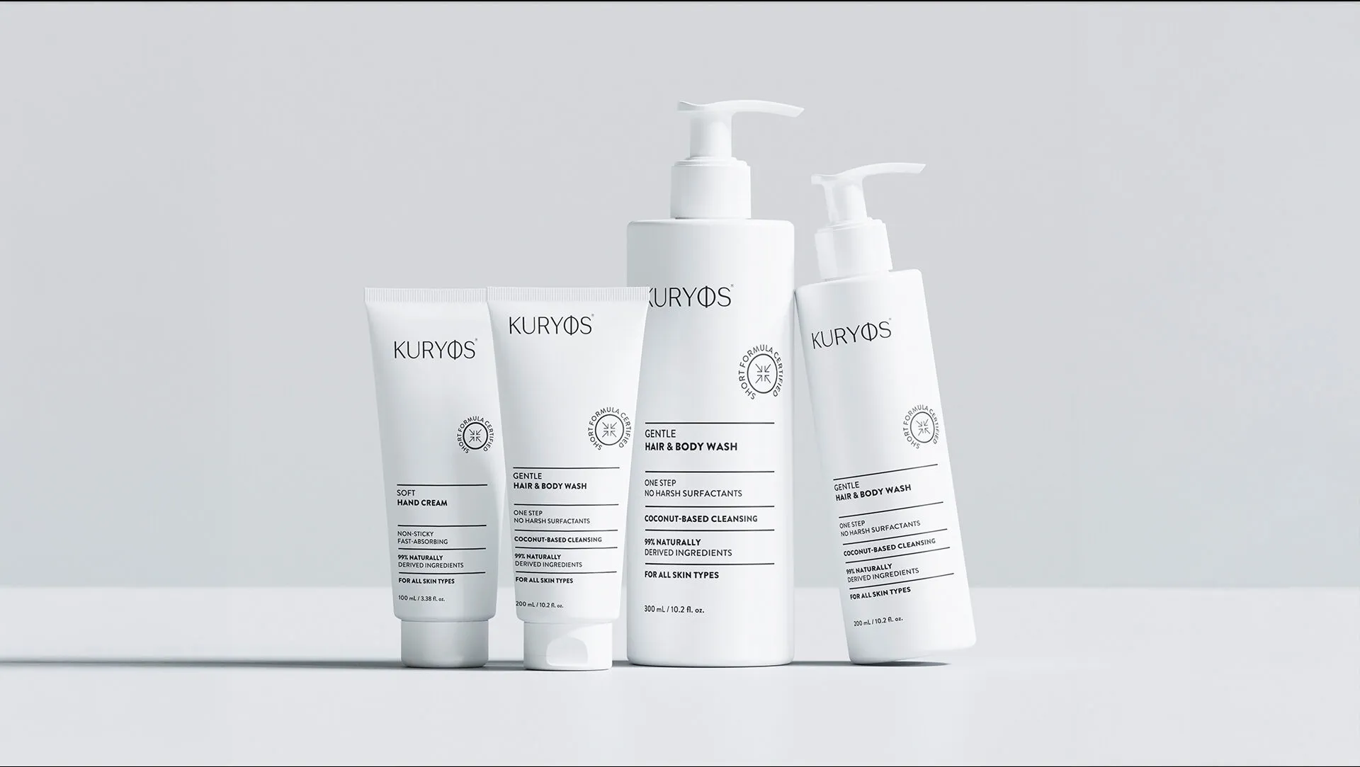
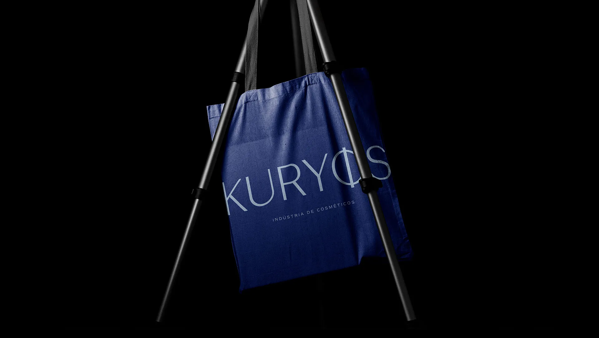
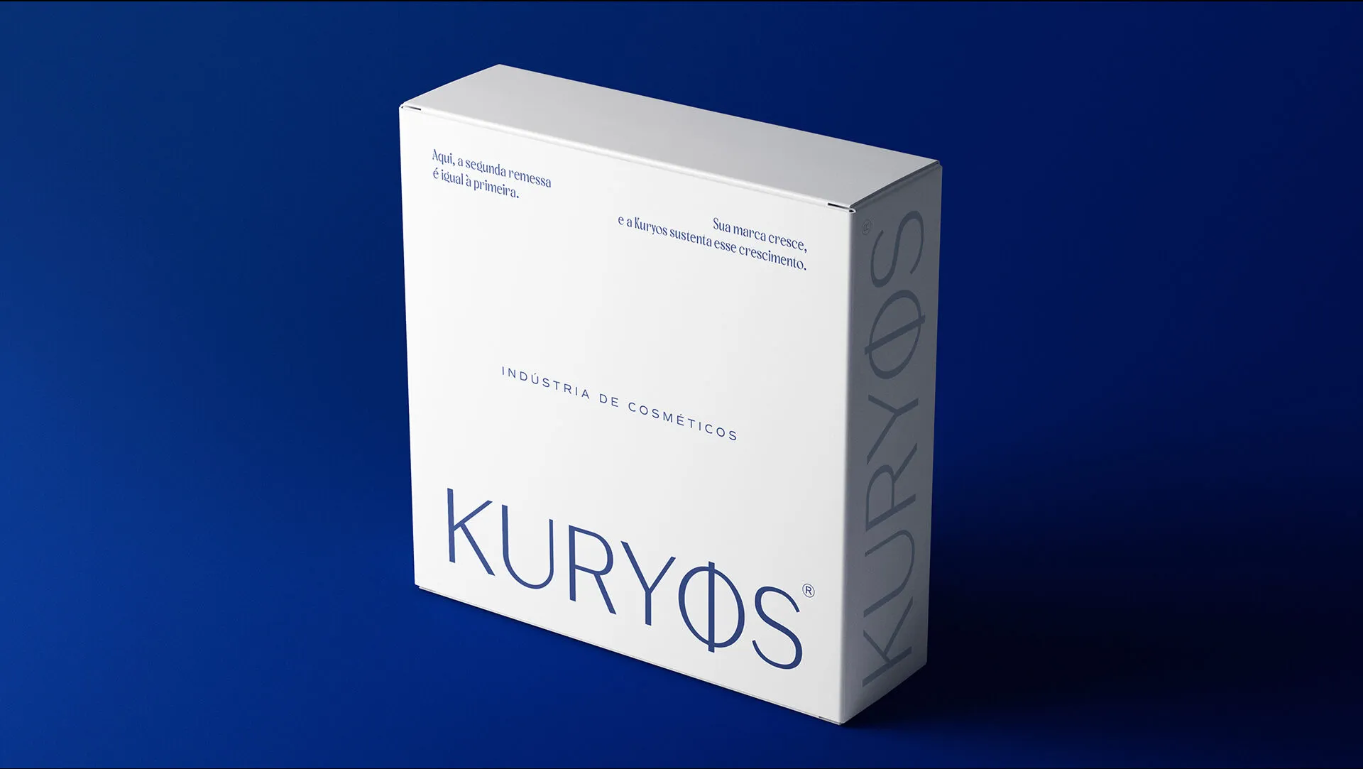
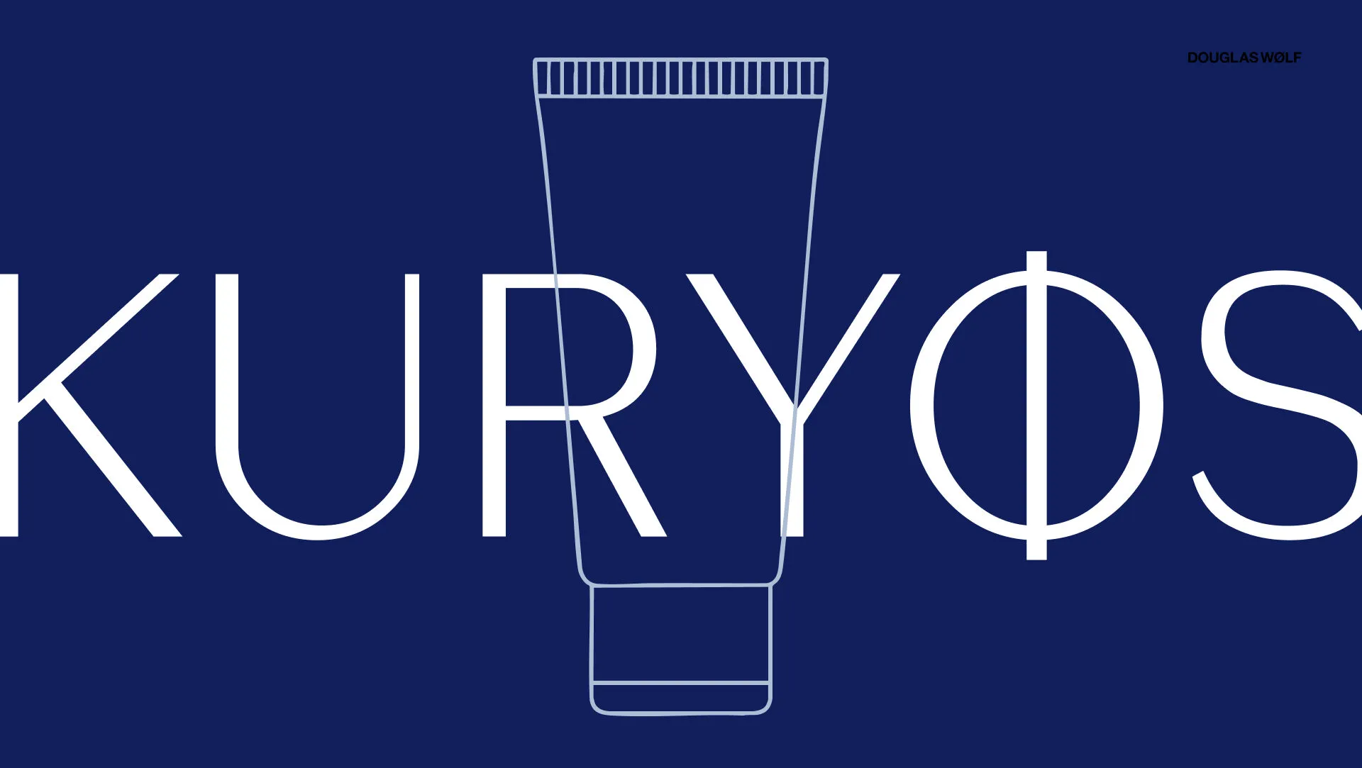
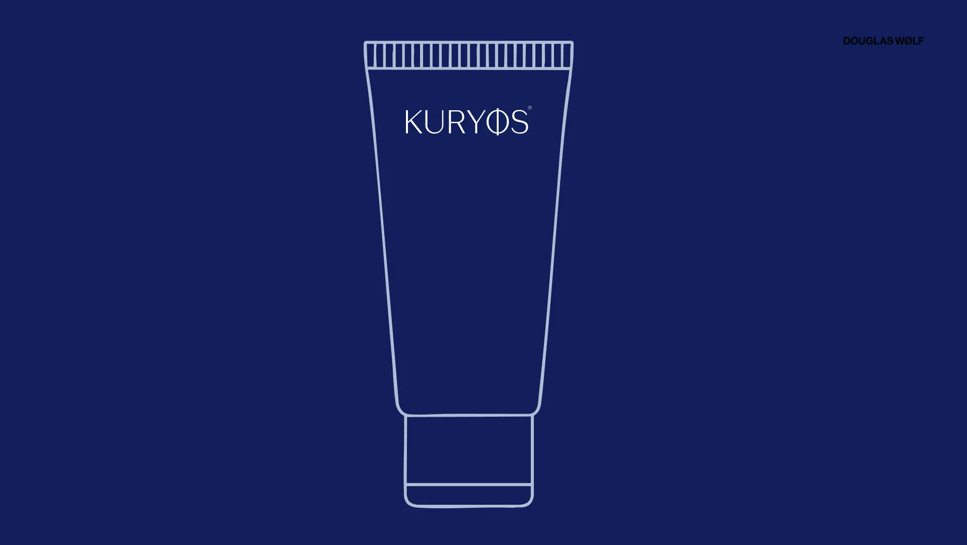
Decision. A wordmark with an integrated symbol, deep blue as the family colour and a labelling system that differentiates products without breaking the unity of the line.
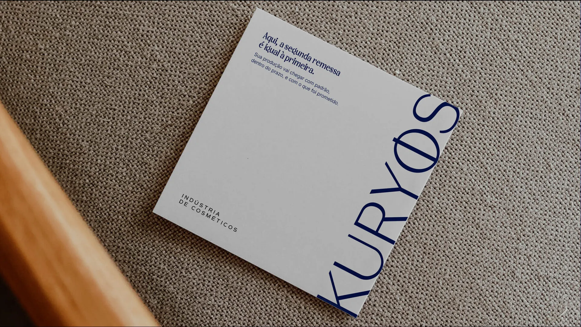
Outcome. Visual identity, packaging system and point-of-sale material.
Decision
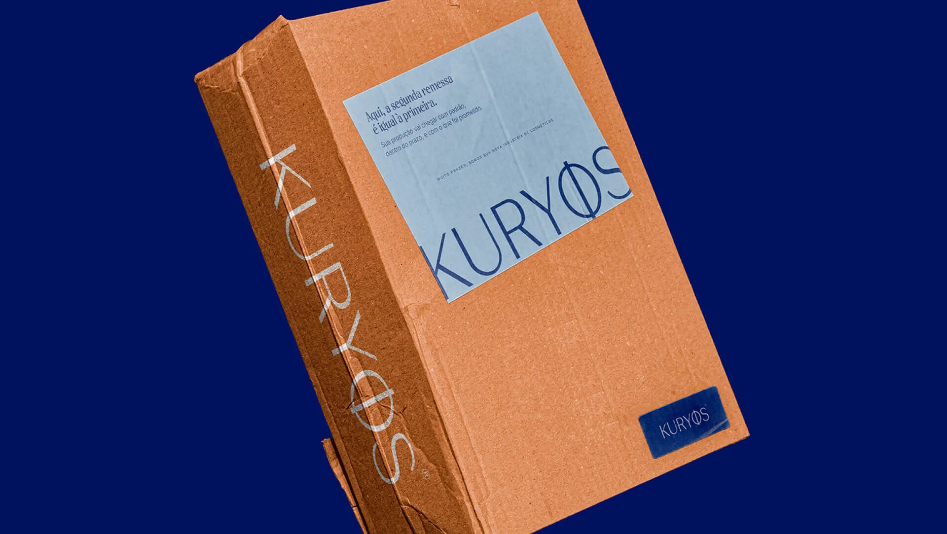
A wordmark with an integrated symbol, deep blue as the family colour and a labelling system that differentiates products without breaking the unity of the line.
Outcome
Outcome
Visual identity, packaging system and point-of-sale material.
Credits
- Douglas Wolf
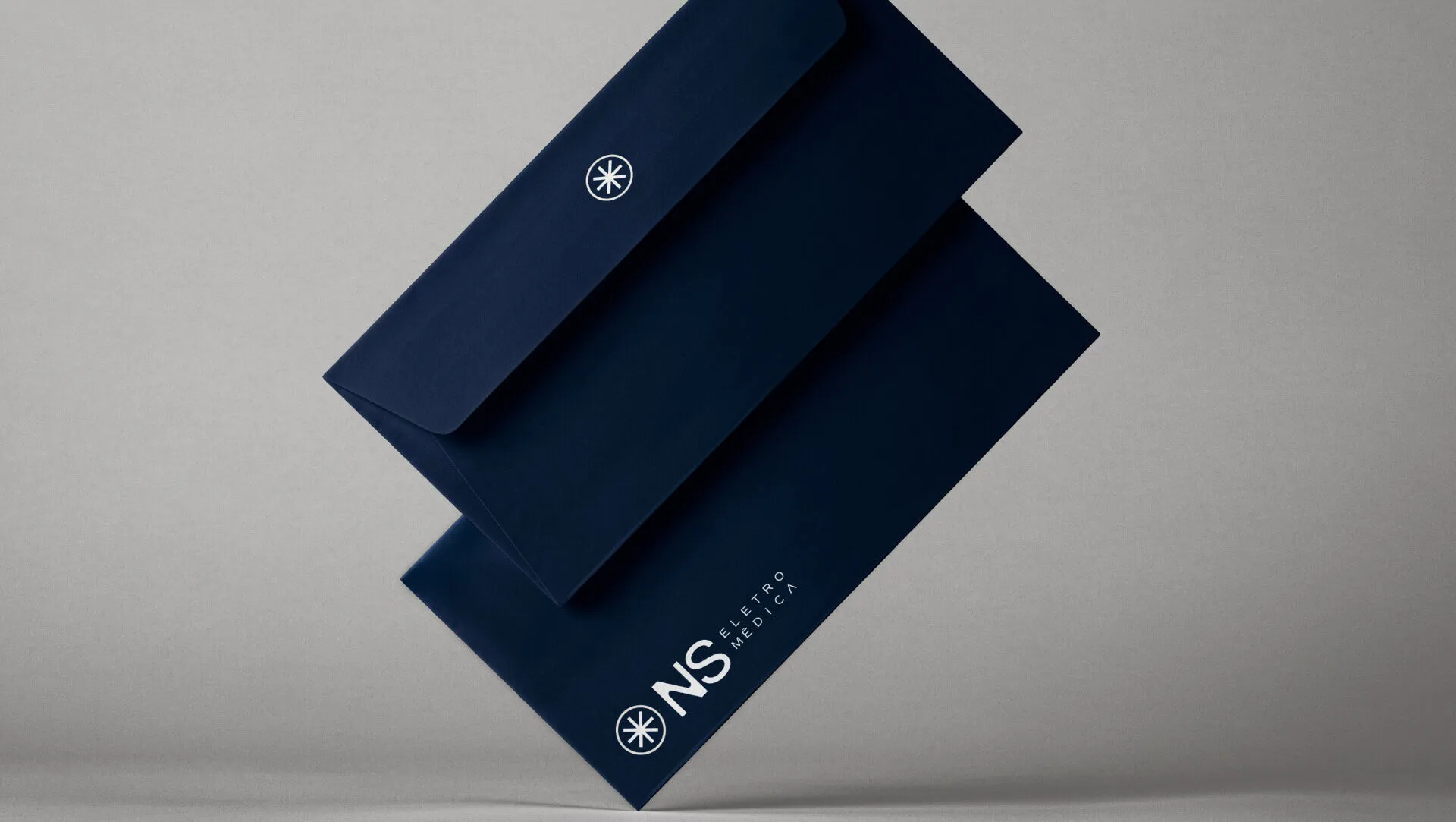
NS Eletromédica