Octoner
- Brand design, Naming
Naming and identity for a brand built from scratch, designed to work at large physical scale.
Context / Direction
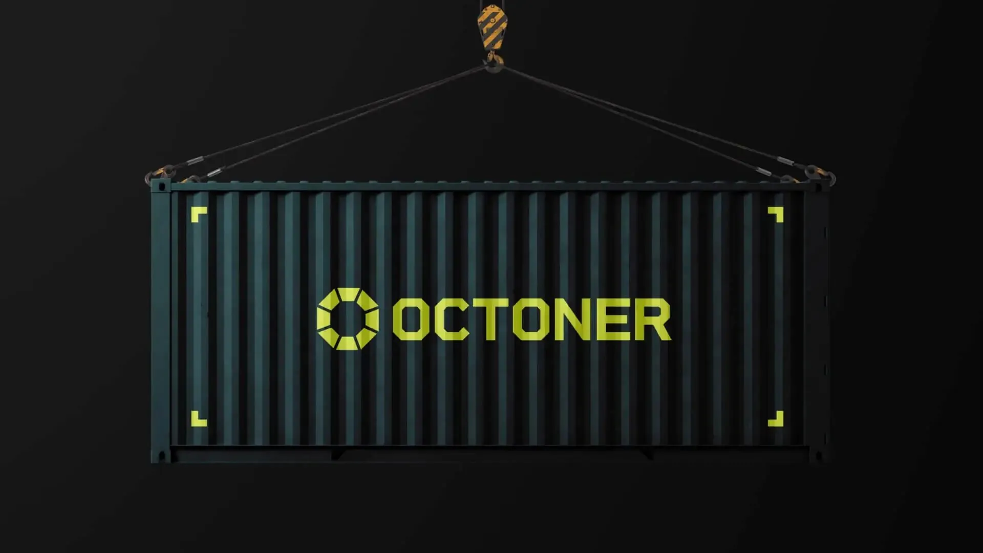
Context. Octoner arrived with no name and no brand. Before any visual decision, the work was to define what the company needed to communicate: solidity, precision and an industrial presence.
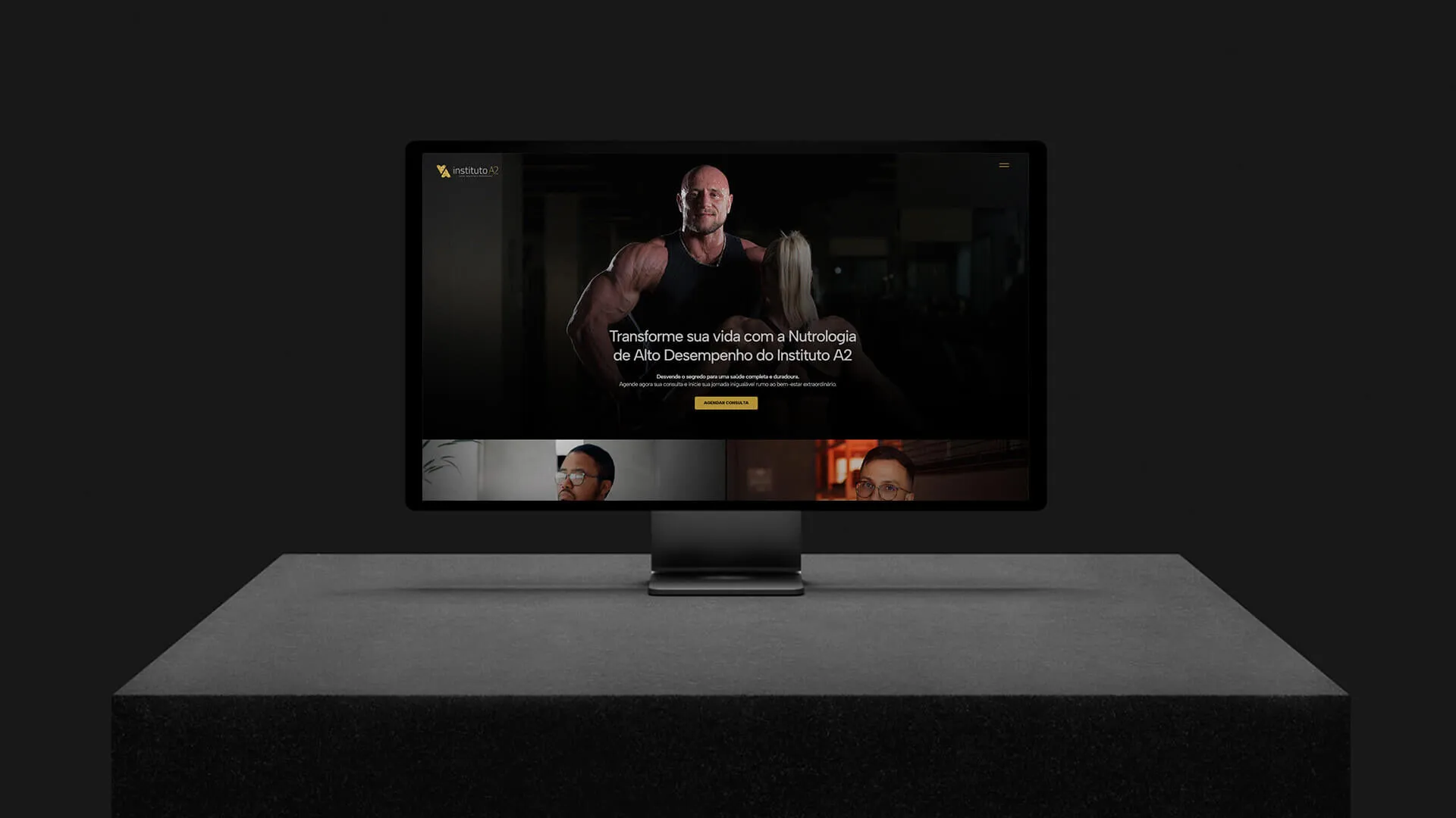
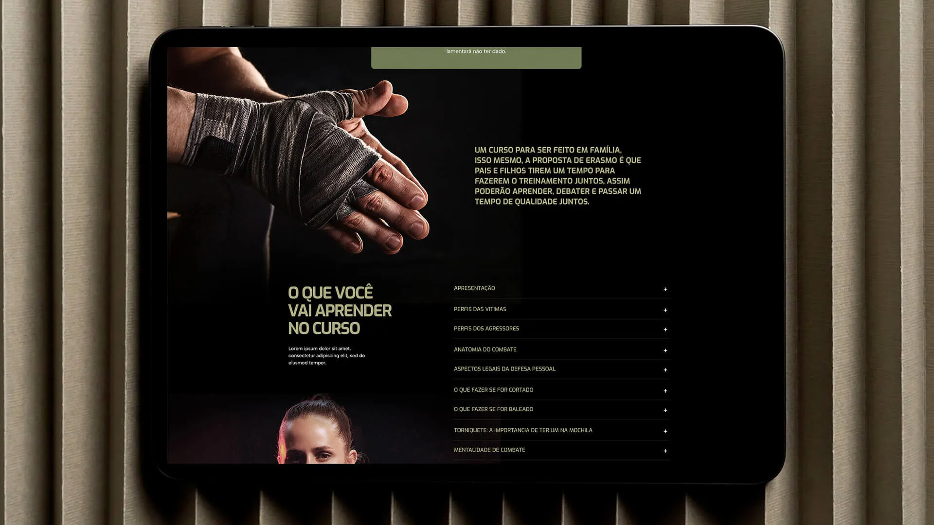
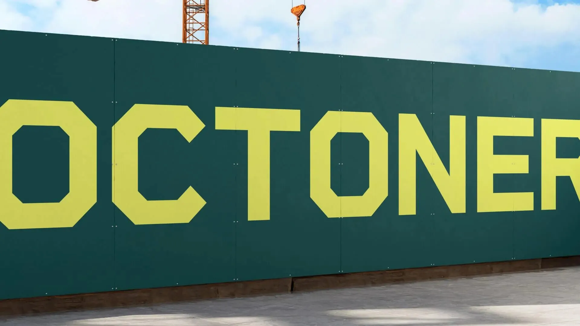
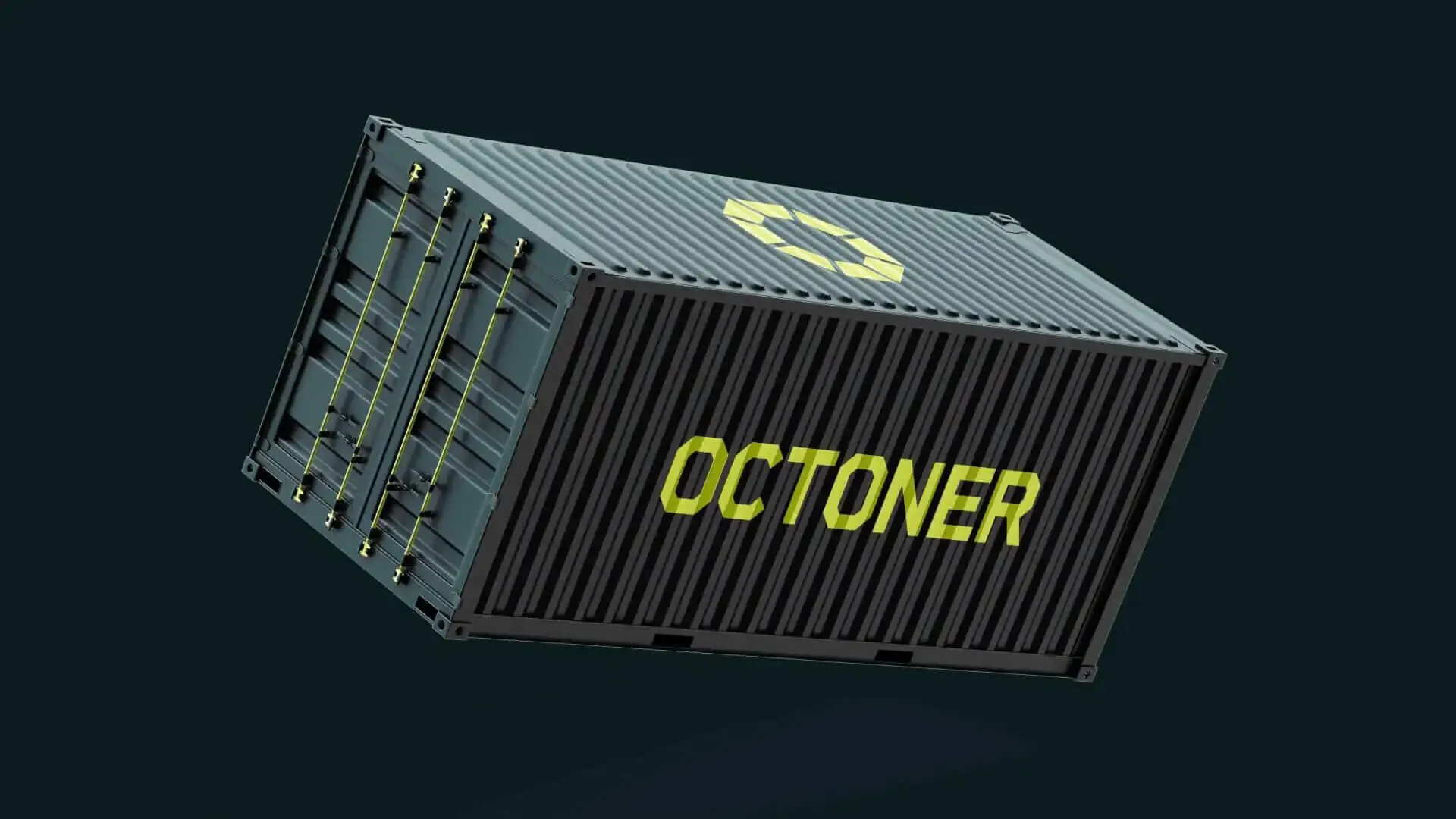
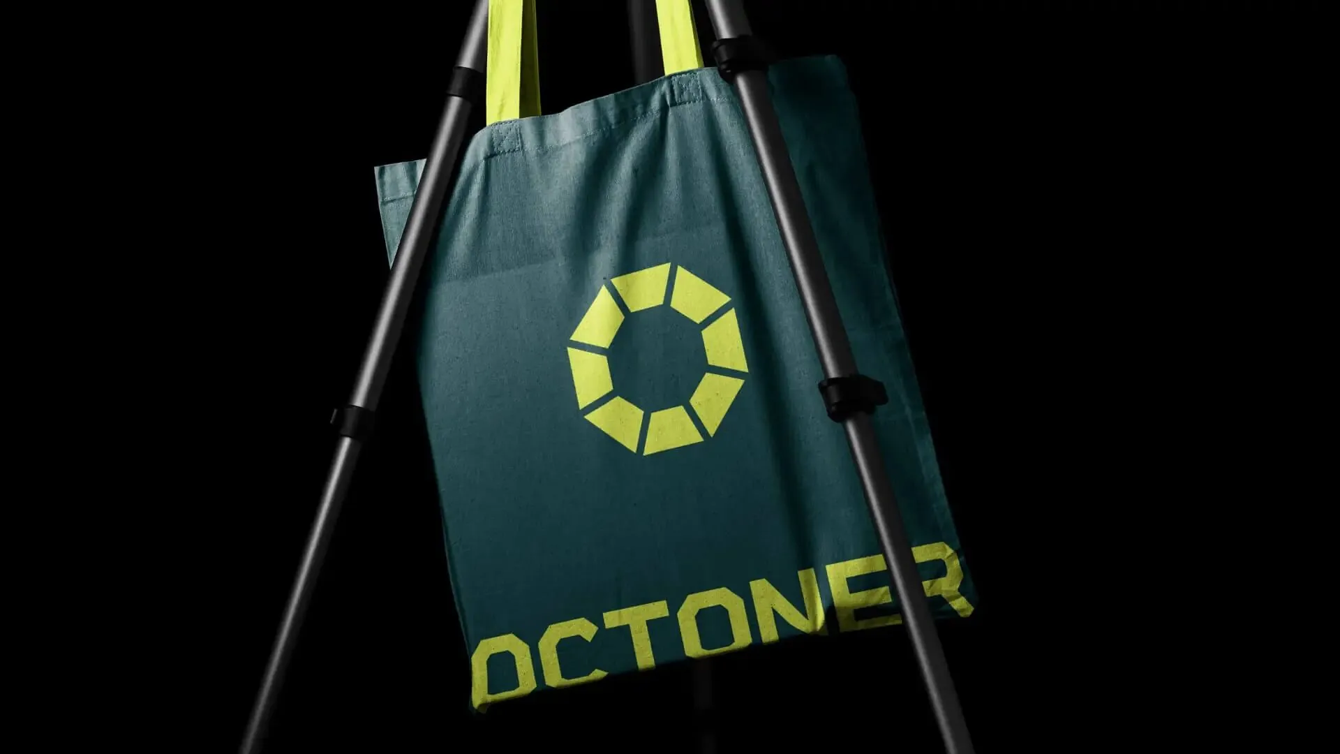
Decision. The name was born together with the symbol — a geometric mark that works painted on a container, engraved in metal or reduced inside an app. Wide typography, one accent colour and plenty of space: the brand does not need to shout to be read from afar.
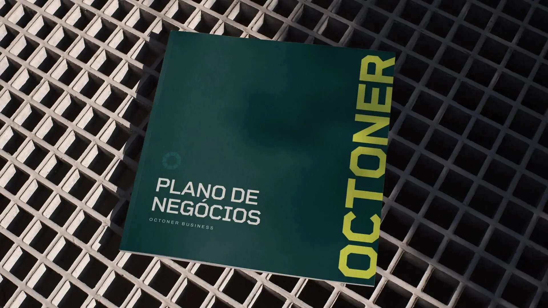
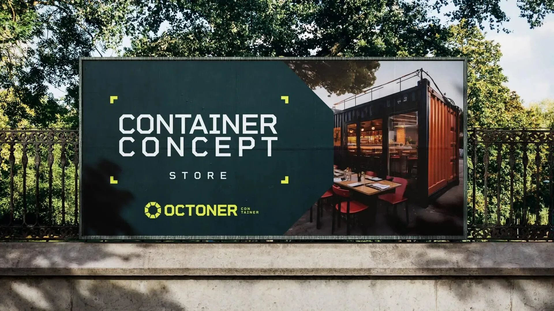
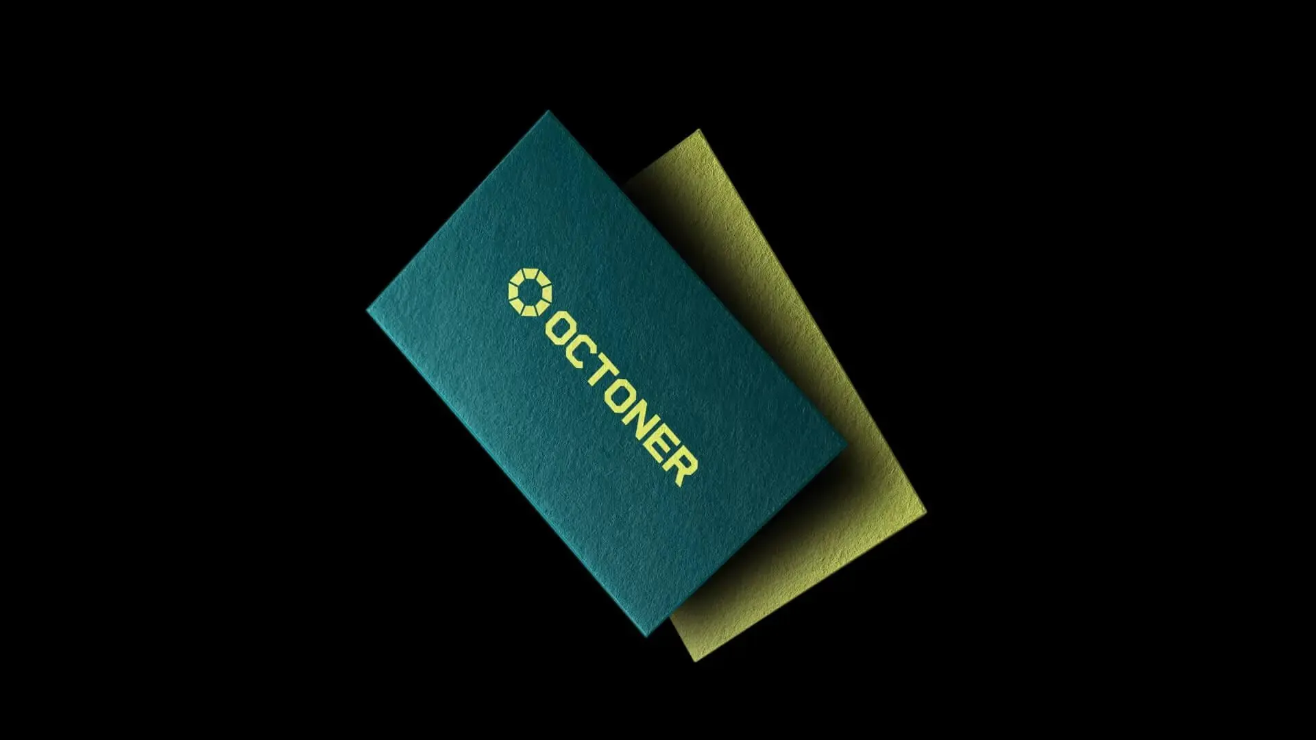
Outcome. Naming, symbol, typographic and colour system, physical and digital applications.
Decision
The name was born together with the symbol — a geometric mark that works painted on a container, engraved in metal or reduced inside an app. Wide typography, one accent colour and plenty of space: the brand does not need to shout to be read from afar.
Outcome
Outcome
Naming, symbol, typographic and colour system, physical and digital applications.
Credits
- Douglas Wolf
Olefoot